
Tasker:
This app actually started as a set of Tasker profiles, which automatically sent a response to text messages while my phone was docked in my car. I'm not sure if you could do all of what it does now, even with 30 Tasker profiles.
From there, I used Tasker's App Factory to turn my Tasker profiles into a simple app, with a simple interface. (I used literally the first ever publicly available version of App Factory to do this.)
It looked like this:


Pretty hideous compared to what it is now, and the icon was just something I pulled from Tasker. Because it was so hideous, I decided to learn how to make an ACTUAL Android app, and code it myself. The first coded version looked a lot better, but still needed a lot of improvement.
My Own Code:
I asked a friend of mine from high school, who is into digital design, to design an icon for me. I told him I wanted something that looked like the stock Android messaging icon, with an arrow pointing left, signifying a response. He came up with the icon I have now, but with a white arrow... I used GIMP to add the blue to give it a little more contrast (and to fit the ICS color scheme.)


Above is the first coded version. As I said, a step in the right direction, but still not quite there. Even the title bar did not follow Android convention. The icon was only actually visible in the app drawer. Plus, at this point, the functionality was still pretty basic: enable/disable and car dock functionality. No scheduler, no responding to voice calls, no silencing ringer... none of the other options that I have built in today. (It didn't even have a menu to put options into.)
The list of messages had no details, no sorting... just the name of the message, and an option for a new message. And if I recall correctly, there was no edit on those messages either, just delete.
There were only 3 screens in the whole app... the two shown above, and the "New Message" screen.
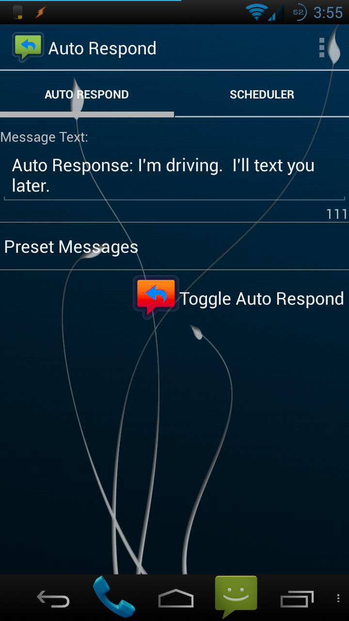
Where I am Now:
It's amazing that in about 3 months, it went from that, to this:


(For the record, the red and purple icons were edits that I made using the original icon in GIMP.)
This is a LOT more pleasing to the eye, and it more closely fits in the Android standards. The app now has roughly 20 screens, maybe more, when taking into effect the various settings screens, the about screen, help screen, feedback screen, scheduler screens, etc. Some of these screens even have 2 different design files - one for Android 4.0+, and a separate file for Android 2.x. This is necessary because of the different design standards between operating system versions, and some of the new features in 4.0+ will cause the app to crash in 2.x. (Yeah, there's a lot more to it than most people realize!)
For those of you who can apply themes to your phone (some phones/ROMs come with a way to apply themes, some don't) part of those themes may apply in the app!
I downloaded a theme called "Blue Elegance", and it made the app look like this:
Moving Forward:
Today, I did a little more overhaul of the look. All of the check boxes are now on/off switches for users on Android 4.0+. For those of you on 2.x, sorry. In order to give you switches like that I'd have to design a custom view, and it would be entirely too much work for a small interface change.
If you are one of the few people using the paid version on Android 2.x, the check boxes for the schedules are now toggle buttons. (not the same as the on/off switches available in 4.0+, but similar.)
I have not fully tested these changes. They seem to be working in 4.2, but I want to make sure that none of the changes messed things up in 2.x, and my emulator on wasn't working properly when I originally wrote the code.
Also, this is a small change, so I will likely try to build in some more changes before releasing a new version. This post was more to show the progression of the app, and mostly the progression of the interface.
Conclusion:
I hope you enjoyed the journey from having an idea for an app, to having a fairly polished app on the Play Store. I put a lot of work into this app, and take a lot of pride in my work. This should show you exactly how far I have come in a matter of a couple months!
If you want to see ALL of my screenshots over the multiple versions I've released, they're all in a public folder in my Dropbox.
https://www.dropbox.com/home/Public/Android/Auto%20Respond/Screenshots
No comments:
Post a Comment